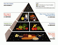
Today marks the long-awaited and much-needed retirement of the 20 year old symbol of a healthy diet: The Food Guide Pyramid.
Problems with the Food Guide Pyramid were mostly that is was extremely confusing to most ordinary folks, so the USDA came up with MyPyramid.gov to show just how awesome healthy eating can be.
The idea was to promote healthful eating by designating the larger bars on the pyramid as grains (orange), veggies (green), fruits (reds) and dairy (blue) while the slimmer bars were meats and beans (purple) and fats and oils (yellow). The androgenous person climbing the stairs to the pyramid is supposed to promote physical activity; but how your average person is supposed to deduce this from a stick figure walking up the side of the pyramid is beyond me.
Mypyramid.gov was the United States Department of Agriculture's way of conveying healthful eating and exercise for the average American. Once on mypyramid.gov there was all sorts of helpful info about eating right and you could even get a personalized diet by entering your age, gender and height. The website itself is pretty useful and easy to navigate but many nutrition professionals felt the pyramid was difficult to understand and did not address one very important issue: portion sizes.
That is why the brand new MyPlate.gov guide is so fantastic.
The new feature replaces the pyramid with a plate and emphasizes vegetables and fruits as the more important groups while decreasing the amount of protein-a good message for the post-Atkins, protein-crazed American. Additionally there is no place for fats and oils and the dairy group is represented by glass-implying milk instead of cheese and fattier dairy items.
When you click on each area of the plate the website takes you to a description of appropriate foods form that group.
Why it's better:- emphasizes portions
- easier to understand
- eliminates fats and oils
- emphasizes dairy from milk instead of cheese, ice cream, etc.,
Why it isn't better:
- physical activity is gone
- while myplate emphasizes portions, it doesn’t really give an estimate or suggested amount unless you enter your info for a personalized plan.
All in all the USDA did a good job recognizing the need for a change from mypyramid. It has been suggested by some that mypyramid has always been a giant billboard for whichever industry can afford to pay the highest price. For example, I know a few RDs feel the reason the dairy group is as large as it is (was) on the pyramid was because the dairy council was a big contributor to the USDA and that the dairy industry as a whole would like us to believe we are getting a lot more calcium from dairy products than we actually are. I can't comment on that because I haven't researched it enough but as we all know, pretty much every industry is influenced by money, so I wouldn’t be surprised.
However, for now the new MyPlate.gov guideline for healthful eating helps calls attention to the out of control portion size issue currently plaguing our country and its citizens. For a gander at how other countries define healthy eating, peep these dietary guidelines form around the world.


No comments:
Post a Comment